All Surrey Libraries branches will be closed Tuesday, July 1 for Canada Day.
Improved Contrast
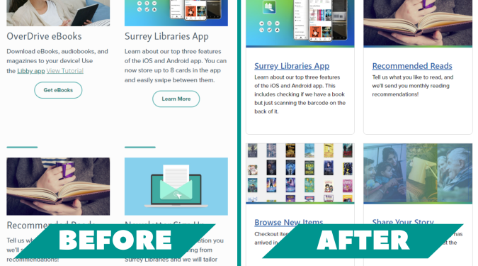
Our old site might have felt softer, but increased contrast helps everyone read the site better.
All Surrey Libraries branches will be closed Tuesday, July 1 for Canada Day.
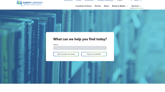
Did you notice? We upgraded our website! These changes bring important accessibility features, allowing everyone to use our site a little easier.
Take a closer look at some of the changes.
Our old site might have felt softer, but increased contrast helps everyone read the site better.
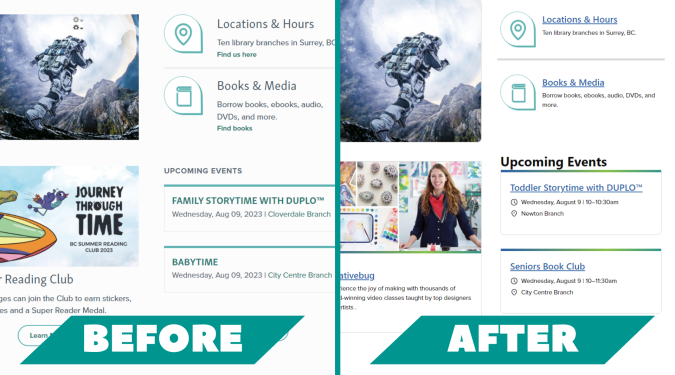
When you move your mouse over a card on our site, you will see it raise a little. This is called a hover state and it is an added visual cue. See it around the little Bee-Bot below or try it out for yourself.
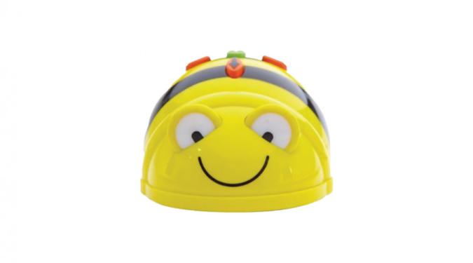
Learn to code with Bee-Bot! A robot designed specifically for use by young children. Bee-Bot teaches sequencing, directional language, and problem solving.
You will see less 'learn more' or 'login' buttons. This change is for screen readers, tools that read aloud the text of pages to users. Limiting buttons creates an easier to navigate website for screen reading software.
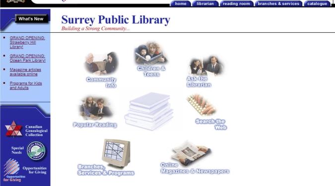
A lot has changed since our 1999 homepage.
